8 Tips on Choosing a Vehicle Wrap Design for Businesses
Get a Quick QuoteIf you have a fleet of vehicles that need a unique design, you should consider your options. Here are tips on choosing a vehicle wrap design for businesses.
You use every ounce of energy in your body to look away, but you can't. You're drawn in by the rainbow-washed colors, the elegant details, the simplicity of it all.
No, this isn't a description of a flawless Hawaiian sunset. What you're looking at is a van with a sleek wrap design.
Are you interested in generating this kind of attention for your business? Then level up your marketing strategy by investing in a head-turning vehicle wrap design.
In an age where people are bombarded with information, you need to find creative ways to stand out from the pack.
Social media platforms are fine, but people won't be stuck in quarantine forever. They're ready to be out and about, and you need marketing content that can keep up with the pace.
It's time to get off of Facebook and take your message to the streets.
Read on to learn how you can go about picking the best design for your vehicle and boost your company's brand in the process.
1. Survey Your Space
You always want to start by taking note of what you have to work with. Measure the dimensions of your vehicle and determine how much space is available to you. Your vehicle's surface area will influence the flow of your content. Consider good locations for logos on the sides and whether there's enough space to add to the back. Having a good sense of the layout will help you decide how to space out your design and keep the smaller details organized.
2. Know Your Market
It's important to remember that you're not the only company in Oahu with this idea. Plenty of other competitors want to get their brand names out there as well. Study your industry and see what other companies are doing. What messages are on their vehicles? What designs do they use? Once you determine common trends, you can come up with something different for your vehicle. The last thing you want to do is copy a competitor in message or design. It's easy for brands to blend together, so you'll need to be unique in order to stand out.
3. Pick a Great Partner
To create the best design possible for your company, you'll need a reliable vehicle wrap provider who can follow through. Research the surrounding area for local companies that offer a variety of wrapping services. After looking at online reviews, request an appointment with intriguing providers. It helps if companies can prove that they know what they're doing. Don't settle for any provider. You should consider all your options before choosing a vehicle wrapping company.
4. Choose Eye-Catching Colors
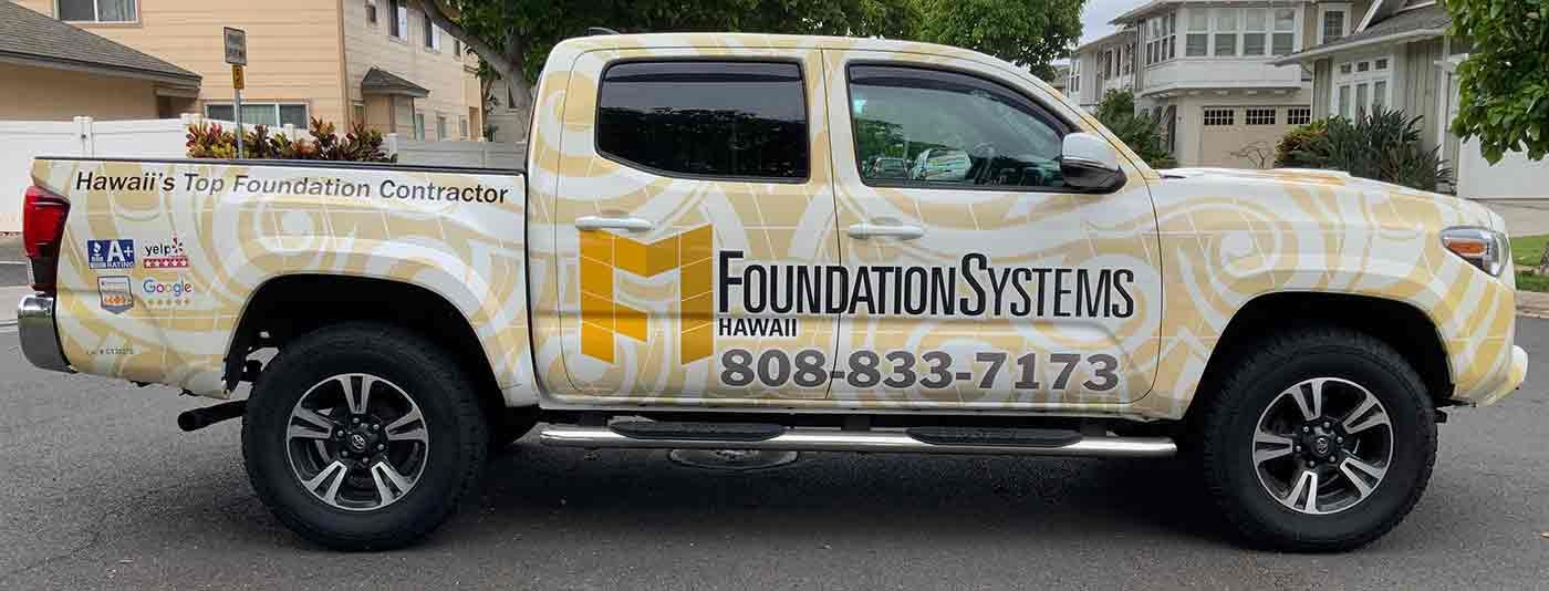
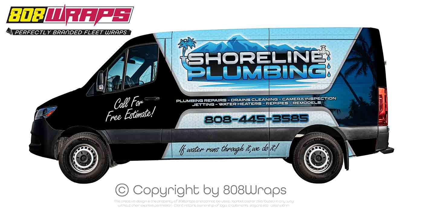
Nothing catches the eye like a splash of spritely color. You want people to associate your brand with bold designs and brilliant displays. Don't hold back on your color scheme. Unleash bright shades of red and orange, blue and gold, or green and pink. Feeling aquamarine or turquoise? Go for it! The first thing that people will notice about your vehicle is the color scheme. Pick the right set of colors, so you can make a good first impression fast.
5. Say It Loud and Proud
Colors and fonts go hand in hand, so your font needs to match the flash of your colors. Pick a bolded font that's easy to read. Remember, people only have a few seconds to glimpse a vehicle as it drives by, so your font shouldn't be too fancy. Pick a simple and strong font that people can absorb quickly on the road. Find the right balance between colors and font, and you'll create a powerful display that's sure to increase your customer base.
6. Show Some Personality
The image you choose for your wrap design is crucial for your brand. A logo tells people a lot about who you are as a company, so you want to make sure you're putting your best foot forward. If you're an animal shelter, you may want a smiling puppy as your logo to convey warmth. If you're a security agency, you may want a solid shield to convey protection. Selecting the right image can give people an idea of what your company is about and what they can expect from you. And if you can't decide on an image for your vehicle, ask your vehicle wrap provider for suggestions. They can give you advice on how to use the space on your vehicle to your advantage.
7. Stay Consistent
While you have many options for designs, you don't want to lose sight of your larger company vision. You need a logo that moves well across different spaces and platforms. The same logo you use on Facebook should also be the logo on your vehicle, so people can recognize your company in different contexts.Spreading a single, constant design is much more effective than trying to spread many designs.In a world filled with advertisements, repeatedly exposing people to the same logo will help your company stick more in their minds.
8. Keep Your Vehicle Wrap Design Simple
Although you want your logo to stand out, your design shouldn't take up the entire size of vehicles you're using. Blank space is just as important as your logo, colors, and fonts. In fact, blank spaces can actually draw attention to concise information on your vehicle. Because people don't have a lot of time on the road, your design should remain simple to avoid turning people off with too much flare. As long as you convey the basics, blank space can funnel people's eyes towards your company's logo.The best design is a balanced design.
Get Out There
Stop waiting for customers to find you, and craft a mobile marketing strategy to get people talking about your brand. It's no longer good enough to reel in Twitter followers and Facebook friends. You need a vehicle wrap design that stays with people on the go.Internet ads distract people for a moment, but everyday casual encounters actually make people feel like they know your brand. Read our blog and contact us for more ways on how you can revamp your brand recognition strategy. The body content of your post goes here. To edit this text, click on it and delete this default text and start typing your own or paste your own from a different source.

