Color Psychology, Vehicle Wraps, and Your Business: A Marketing Guide
Get a Quick QuoteHarness the power of color psychology with your fleet's wraps and graphics to draw more interest, inquiries, and sales. Here's how to combine it all.
Did you know that 91.3 percent of households in the United States have access to at least one vehicle? In this vehicle-dominant society, hours of our lives are spent commuting on local roads and highways. This is one of the top reasons that large billboard advertisements are still prevalent throughout cities. For the same reason, you can leverage this information by investing in vehicle wraps for your business. If you're on the road a lot, a vehicle wrap with your company name and contact information can pique people's interest, build brand recognition, and even increase sales.
However, not all vehicle wraps will capture people's attention–you need to pay attention to color theory for it to work. Read on to learn how a combination of color psychology and eye-catching vehicle wraps can help garner more interest in your business today!
What is Color Psychology?
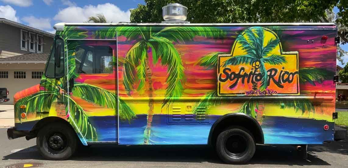
Before we get started on our recommendations, it's important to know a little bit about color psychology and how you can utilize this knowledge to choose the best color scheme for your vehicle wraps. Color psychology refers to the study of using color in order to affect a person's mood, change their impression of a space or object, and more. If you choose the wrong colors, people are less likely to pay attention to the wrap on your car. On the other hand, the right combination of colors will capture people's attention faster. For this reason, using high color contrast is one of the most effective ways to draw eyes to your company vehicle.
What is High Color Contrast?
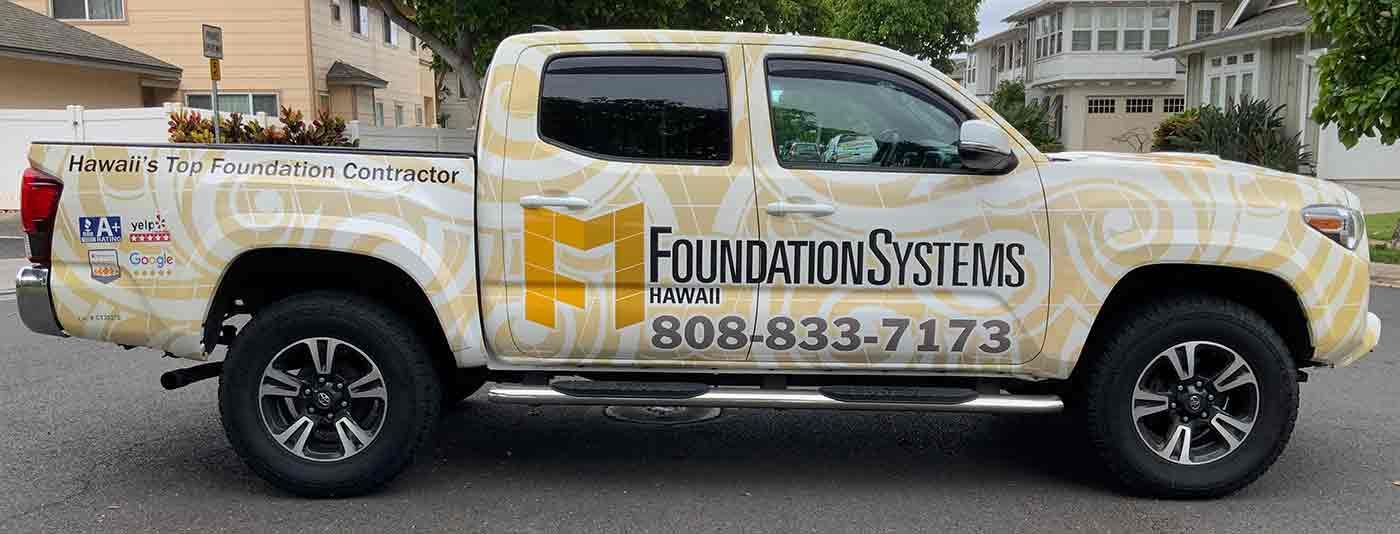
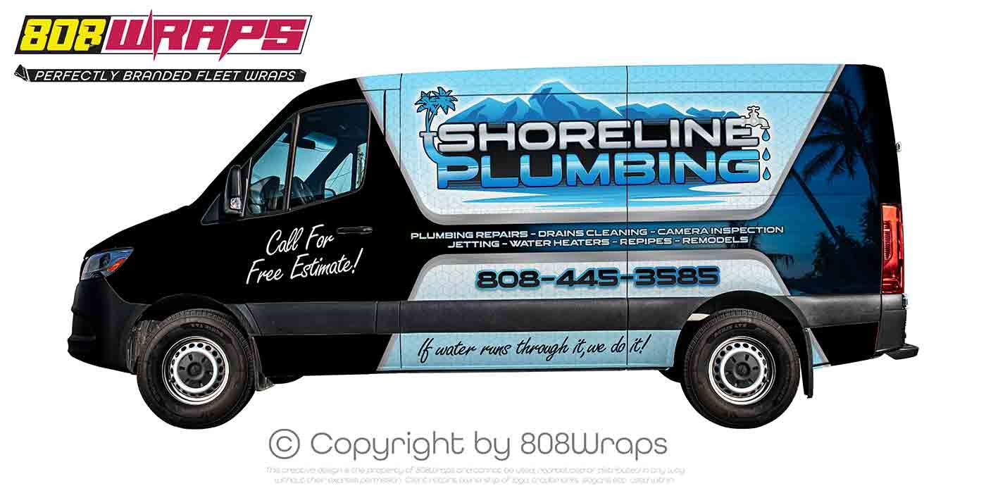
High color contrast refers to using complementary colors. Complementary colors are those that are opposite each other on the color wheel. This means that both of the colors together help the other stand out, creating a bold combination. As we go over some of the most popular complementary color combinations, you may recognize them used for other popular brands, sports teams, and more. The reason for this is because their marketing teams are also aware of color psychology and the impact of high contrast colors!
Here are some complementary color ideas:
- Blue and orange
- Red and green
- Yellow and purple
Using high color contrast on your vehicle wrap also enables people with color blindness to still read the information clearly on your vehicle.
If you want to use three colors on your vehicle instead, of two, consider using split complementary colors. With a color wheel in hand, choose a bold primary color as your main color. Instead of using the opposite color as your second color, use the two on either side. This will give you three colors that are visually exciting and complement each other. There are also analogous colors (next to each other on the color wheel) and monochromatic colors. However, these don't provide the eye-capturing clashing that complementary colors give.
Color Meanings
Beyond color contrast, we also recommend considering color meanings before making the final decision on the colors you'll use on your vehicle wrap. The colors you choose can communicate your brand's personality, values, and even trustworthiness.
Here are a few common color meanings to get you started:
- Red - Dominance, energy, excitement, health, life, strength
- Orange - Daring, fun, extraversion, lively, happiness, warmth
- Yellow - Cheerful, friendliness, happiness, optimism, creativity, arousing
- Green - Harmony, calm, comfort, serenity, soothing, security
- Blue - Dignity, relaxation, reliability, trust, intelligence, successful
- Purple - Regal, dignified, sophistication, spiritual, authentic, luxury
- Pink - Charming, feminine, soft, warmth, sophistication, gentle
- Brown - Outdoorsy, rugged, nature, tough, security, masculine
It's important to keep in mind that interpretations of the meaning of each color can vary depending on the context of its use, a person's culture, and more.
Choosing Your Vehicle Wrap Colors
When it comes to choosing the main color of your vehicle wrap, it's important to keep a few things in mind. Beyond the meaning of each color, remember your:
- Brand personality
- Target audience
- Competitors
You'll want to choose a color that matches your brand. For instance, if you're an art supplier, you may want to choose colors that symbolize harmony, sophistication, or reliability. You'll also want to consider your target market.
If most of your customers are adventurous women in their twenties, they may respond better to vibrant colors such as yellow or orange versus brown or purple.
Lastly, remember that you also need to keep in mind what your direct competitors are using. Make sure to choose colors that set your brand apart so that there's no confusion. Even if you feel as if you can differentiate your brand in other ways, using the same colors as a competitor will make it significantly harder for you.
Although black and white also have common color meanings, on a vehicle wrap white is usually used as negative space. Black is also recommended for the text on your wrap so that it stands out from the rest of your designs.
Invest in Vehicle Wraps Today
With over 90 percent of people in the United States owning a vehicle, you know that capturing attention on the highway is an effective way to draw attention to your local business. However, you need to consider the design of your vehicle wrap as well as the color psychology.
With the right color combinations, you'll have an easier time drawing attention to the information on your vehicle wrap. Make sure that all of your contact information is large and visible. A phone number that's easy to memorize also comes in handy for those times.
Ready to begin your vehicle wrap project? Get a quote from us today to get started!





All Rights Reserved | Terms and Conditions


